
Long read 30 min
This is a ‘fundamentals’ post which are selected excerpts from the forthcoming The Scale Modelling Photography Manual.

We live in a digital world. All digital cameras, and the display screen you are reading this on are all about the magic of pixels. Forget DNA, these little squares of electro-optical colour are the digital building blocks of our modern image obsessed, social media driven (and AI manipulated) society.
Those tiny red, green and blue squares which mix together before our very eyes are everywhere but do we really need to understand how they work?
Well yes we need a working knowledge at least, but before we consider what digital images are made of in part 2 of this post, we need to take a step back and look at conventional physical colour theory to understand the way we think about and experience colour.
We’ll start with the physical ‘subtractive’ colour system.
Subtractive colour – (all physical pigment colours)
Our early experience of mixing colour in school often creates a common misconception that the red, blue and yellow paint mixing process we remember is the ‘universal’ and only way to create colour.
So much so that many people just assume that all colours are going to be the same regardless of where and when we view them.
Take this red on the Ducati for example – will it be the same red in real life, or in a printed book as it is here on our computer screens or smart phone?

No, in reality that red will look slightly different depending on how, where and when we view it, and this difference is all down to some variables:
- the temperature of light (and that light source’s CRI rating – see post 1) which falls onto the model surface colour
- that colours’ ability to reflect and absorb light
- the ambient room light we view the model under (or the screen)
- the purity of the red pigment
- the accuracy of the cameras’ colour temperature setting (White Balance) which records the colour
- the capability of the display screen to display a full range (or gamut) of colour
- the capability of the screen to display true black values (this impacts colour intensity and vibrancy)
- the ‘whiteness’ of the paper the image is printed on to display the red inks’ colour value. And so on. . .
So how does physical personal experience of colour work in relation to our ubiquitous digital screen experiences of colour as seen by many?
Well, the Ducati graphic above shows in simple terms how on a physical object, the red paint pigment absorbs all the colour frequencies contained in the daylight (or artificial studio light) shining on the model, to reflect only the red part of the light frequency back to our eyes.
This is subtractive colour in action, and all physical pigment colour conforms to this process.
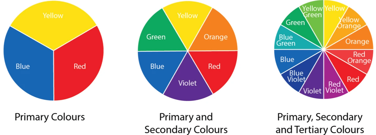
Pigment colours – RBY and CMYK primaries
Going back to basics for a minute: All colour is based on the mixing of three primary colours (Primary = cannot be made from mixing other colour) mixing any two of these produce a set of three secondary colours, which are then mixed to create a set of six tertiary colours – (Tertiary is made by mixing one primary colour with one secondary colour).
Why subtractive? Well combining these colours with each other in different quantities effectively ‘filters out’ or subtracts various colour frequency values. Logic says that if we combine all three primary RBY colours together equally, we should have no visible colour – black.
But this is where it gets interesting – Red, blue and yellow pigments aren’t used in commercial printing.
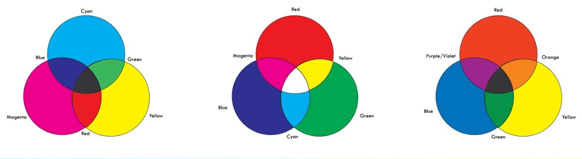
Instead, Cyan, Magenta, Yellow (and Black – K) are the primary colours used in commercial print and in inkjet printer systems to offer the widest range of mixable colour. (Black is identified by the letter K as printers call it the key colour).
In theory, combining CMY (or RBY paint) in equal amounts, should only show black by blocking all colour frequencies, but in reality, pigment impurities create a muddy brown-grey, which is why we have to add ‘black’ ink to CMY.
Here’s how the CMY+K system works for print (remember we are looking at this on a screen, so it’s not an entirely accurate colour reproduction of the CMYK ink values).

The big issue with CMYK physical print colour is that these colours are the secondary colours made in the Red, Green, Blue (RGB) electronic screen additive colour mixing system, and both sets are mutually exclusive.
So it’s easy to see that we cannot hope to accurately replicate CMYK colours in an RGB additive screen colour space and vice versa, but we can get close by spot sampling with a colour picker.
Which means there are colours we cannot replicate digitally that we see on our model in real life because its paint is a pigment and based on the RBY subtractive mixing system. We can get close though, so perhaps maybe that’s enough? We also never (or rarely) experience the physical model simultaneously in real-life next to a printed paper image or a computer screen image.
RBY or CMYK combinations produce around 100,000 individual physical colours, which seems a lot until we consider electronic additive RGB colour which tops out at 16.5 million colours. . .
We’ll cover digital electronic (pixel) colour in the next post and look at why there is a disparity in colour values, how this impacts the perception of period colour reference images and why we should not get too hung up on 100% accuracy – mainly because its very very difficult to achieve when trying to compare colour from two different systems.
Before the next post, here’s a visual idea of how the three colour systems look – they are CMYK (print), RBG (screen) and RBY (paints).
Until next time, go well. Kia kaha, noho kaha.
