
Long read 45 min
This is the third in a series of ‘fundamentals’ posts which are based around selected excerpts from the forthcoming book The Scale Modelling Photography Manual.
Additive (electronic pixel) colour
This post follows up from what we learned about the basics of light and pigment based subtractive colour systems (RBY paint and CMY+K inks) in the previous posts.
The process of making electronic pixel-based screen colours seems to fly in the face of what we were taught about colour mixing in school, and what we have just learned about subtractive pigment colour.
Let’s look now at the additive colour model and how it creates colour using the magic of electricity and pixels.
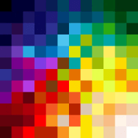
The building blocks of all visual electronic displays are pixels = pi-x-el: picture element.
This is the smallest unit in a digital display and each pixel unit is made up of three sub pixels – red, green and blue (RGB). In simplistic terms, pixels drive our image saturated modern lives, and these tiny squares of electrically activated colour are literally everywhere – we simply cannot live without them.
At the very least, and even if we don’t read any further – we should understand that not all pixels are equal in size, quality, or have the same capacity to display the same colour values. This variation influences a whole world of visual colour values – knowing this is massively important for us makers and photographers of scale models.
But hey, why stop here?
Let’s crack on with learning how this colour works before exploring an example to see how it is applied.
The devil is in the detail
Before we do this, we need to know how human vision correlates to a thing called resolution. Our personal perception of colour and light and how these two things shape our models needs to be understood first because what we see isn’t what the machine sees. The camera lens in a blunt analogy, is an eye, and the pixel covered sensor is the retina but human eyes and machine eyes ‘see’ things very differently.
Human vision – our eyes have a resolution factor too
While we understand colour as being a natural characteristic of most objects, machines don’t have this understanding at all. Obviously cameras have no perception or ability to ‘think’ (yet), and they process the components of light very differently – They are recording devices which have fixed and limited ranges of reaction to light – while our eyes and brain combo are superbly optimised light/colour gatherers and interpreters.
Our eyes, unlike a cameras’ lens – aperture and sensor, can quickly react to minute multiple changes in light and colour – in effect ‘resolving’ the image. We have the benefit of stereoscopic vision too which allows us to percieve three dimensional shape and form – highlights, shadow and everything in between.
We think of the term ‘resolution’ as being specifically about machine imaging (cameras, screens and other electronic devices) but the human eye is a lens with an infinitely variable aperture (iris) and a supremely detailed sensor (the retina), and has a quantifiable resolution. Our organic image resolution is around 576 Megapixels (MP).
There are no cameras which have a resolution that is even close to the human eye.
All this serves to show that the human eye/brain combo is and always will be much better at seeing and interpreting light and colour than any device for the forseeable future. All of which instantly puts the limitations of a digital camera and screen in the spotlight.
We believe our tech is capable of wonderful stuff, but in reality it has some real limits, and the detail, clarity, and colour we can see in real life often cannot be replicated digitally.
Speaking of which, let’s get back to pixels and understand why this is so:
Digital resolution – a revolution
To understand a bit more about pixels and how image quality can vary, we’ll look at display screens first and then move on to digital camera sensors.
There’s a lot of technical stuff written and misunderstood about resolution – Simply put, it’s the number of pixels on any screen which determines the resolution (visible detail), and generally the more pixels, the clearer and sharper the image.
Ahh but . . . here’s where image resolution can get confusing:
We need to be aware of a thing called pixel density. Pixel density is an attribute of a display measured as number of pixels within one inch of screen space, either in the horizontal or vertical direction (don’t ask why it is an imperial unit of measure – but if you live in the USA, Myanmar or Liberia you’re sorted).
The numerical value of pixel density is expressed as ppi (pixels per inch). Pixel density determines the definition or resolution of the display rather than the size of image we are looking at on a device.
Tablets, smartphones, laptops and computer monitors have pixel densities ranging from 150 ppi all the way up to over 500 ppi.
For example: The iPhone 12 Mini features a 5.4-inch display with a resolution of 2340 × 1080 pixels (2,527, 200 or 2.5M pixels), and a pixel density of 476 pixels per inch (ppi).
Compare this with the 13.3 inch Retina Display of a Mac Book Air laptop screen which features a similar larger 2560 x 1600 pixel (4,048,000 or 4M pixels) screen resolution, but only 227 ppi.
Those 4 million pixels on the MBA laptop are spread out to fill the larger screen real-estate and in doing so they reduce the apparent visual sharpness to something approaching half that of the phone’s screen.
There’s lots more to discover about how pixels work, such as backlit LCDs and organic light emmiting diodes (OLED), but we’ll leave it there for now and move on to camera sensor pixels.
Camera sensors: Size isn’t everything (or is it?)
In photography, the term megapixels (MP or millions) typically refers to the resolution capacity of a sensor – not the image file size. Camera makers use the promise of masssive MP to lure buyers with the promise of a huge pixel count equating to stunning image detail.
In reality it doesn’t quite work that way, and we cannot see all of that detail due to the variable pixel qualities of our different viewing screens – what we see is dependent on the ability of the screen’s pixels to radiate colour and light, and of course, our own eyesight and the viewing conditions.
Needlessly complex tech stuff
It’s widely agreed by photography industry professionals that a camera sensor of around 12MP is optimal and more than adequate to create sharp screen-based images. Higher MP values are only really needed to produce large physical prints.
Sony’s Complimentary Metal Oxide (CMOS) sensors are used in the vast the majority of DSLR cameras – and even high end makers like Hasselblad, Leica and Phase One use these, so there appears to be some common ground here.
Smartphones use a slightly different construction. These semiconductor ‘stacked’ sensors typically give smart phones around 12 MP cameras, while interchangeable-lens DSLR cameras typically have anywhere from 12-50 MP.
The DSLR vs. Smartphone debate
These two distinct types of cameras may have sensors with similar pixel quantities, but their ability to capture and display detail in an image are wildly different due to the sensor’s pixel density, physical sensor surface area, and the quality and size of the lens optics which focus and transmit the light onto the sensor surface.
While these sensors may vary due to camera format and aspect ratios, the real difference in image quality lies in the quality of the optical elements.
Pixels by the bucket load!
This resolution/detail quality thing all gets more complicated as we start to understand that 12 million tiny pixels crammed onto a smart phone sensor a few millimeters wide will not have the ability to capture light in the same way that 12 million bigger pixels spread out on a 35mm DSLR sensor will.
But they’re both 12 million pixel sensors, so . . .
Its hard to visualise how pixels contain light, but we can think of an individual pixel in terms of a ‘bucket’ which is filled up with light instead of water. Small pixel buckets fill and spill over quickly into the neighbouring buckets (pixelsites) to ‘contaminate’ (reduce the clarity) their content.
By comparison, on a bigger 35mm DSLR sensor, those 12 million pixels are much larger and can carry more light info in their ‘bucket’ with a wider dynamic range meaning an image is much more able to contain more light data, and more importantly, be enlarged and viewed on a bigger screen with similar sized pixels.
This contamination/blur isn’t really a problem for an image taken with a phone camera which is then only viewed on another small tightly-packed pixel phone screen, but start to enlarge or spread those pixels out to look at the image on a larger computer screen with a similar screen resolution, and everything gets mushy very quickly.
If it’s too hard, I can’t understand it
Needlessly complex and too much geeky tech info perhaps, but from this we can see why our good old fashioned analogue optical device (the lens) in front of the sensor needs to be the best possible, because in basic terms, it is still the quality of controllable light we use to illuminate our models and the camera lens’ ability to transmit this that is vital.
Massive sensors, gazillions of big pixels and pinpoint white balance settings are best – but useless without a quality glass lens.
But this post is about additive colour and how electronic screen colour works, so back to the main event:
Help! It’s all gone a bit blurry
All this techspeak and hopelessly complex pixel/resolution stuff is fine in theory, but how does this work in practical terms for colour?
Well, our vision usually cannot distinguish the edges of the tiny square sub-pixels and they blur together to trick our eyes and visually mix the adjacent pixels on the screen into continuous colours. This works in a similar way to how adjacent colours work in nature, or on printed page where tiny ink dots visually blend together to ‘trick’ our eyes into seeing continuous variable colours.
Yes, yes, but how does it make the colour?
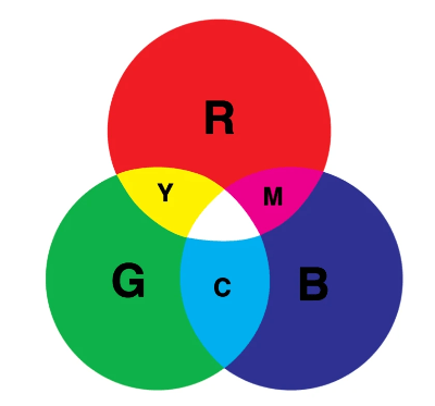
Here’s a recap of the three colour systems we looked at in the previous post: CMY+K (print), RBG (screen) and RBY (paint).
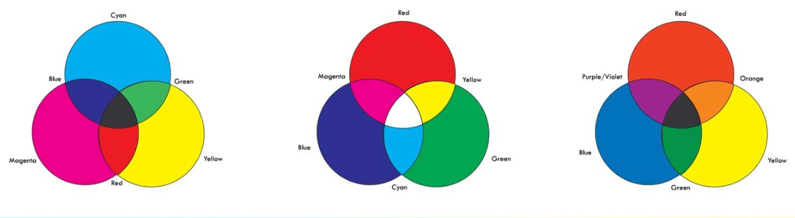
©udemy
Nice, but those RGB screen colour secondaries . . . Arrgh! they just happen to be Cyan, Magenta and Yellow which happen to be our primary ink colours from the subtractive ink colour system. So the two systems are mutually exclusive.
In fact that Red, Blue and Yellow subtractive paint system doesn’t work properly here either.
Don’t panic, its mostly ok to view any of these systems in isolation and be happy that the colours we experience will be an acceptable ‘near’ value, but we may have some fundamental issues when it comes to decoding and defining colour for reference purposes due to that mutual exclusivity.
How much colour can we see (and use)? The full gamut
All of this wailing and gnashing of teeth about replicating and verifying colour fidelity and how hard it is to examine an analogue film image in a digital display space, brings us to ask how much colour can we actually see on our devices.
While we can usually see a massive range of colour values in nature – when it comes to replicating paint or ink in pixels, there are lots of paint/ink colours that will never reproduce accurately on screen and conversely, screen colour values that cannot be reproduced by the paint/pigment system.
We say ‘see’ – with the caveat that everyone is different and if we add in a colour vision defect or vision aging atrophy and retinal damage, we restrict or modify colour perception still further – the modelling demographic is by default, largely made up of grumpy old codgers who are getting older.
So yeah, that RAF Sky aint Sky to my eyes buddy. . .
Gamut – Means a complete range of visible colour. There are out of gamut colours we can see, but cannot be replicated by our screens, or with ink or paint combos and the graphic below is a representation of a standard visible colour space. It shows how much visible colour cannot be reproduced accurately by the various systems.
This graphic is a CIE 1931 gamut diagram and is widely used as the defined quantitative link between distributions of wavelengths in the electromagnetic visible spectrum (EMS) and perceived colours in normal human colour vision.
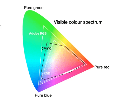

Also: The sRGB gamut is closest to CMY-K, so this is another reason to set our cameras’ colour space to sRGB and try to get as close to the printable colour gamut as possible.
Lets get back additive to conclude our look at how we see, use and adapt to colour:
How much is too much?
Currently all electronic pixel-based screens can display 256 distinct values of red, green and blue. These describe each colour from its darkest value to its lightest by way of 255 individual points of reference.
Each pixel on the screen is ‘off’, and should start out as black with a numerical value of 0, until it is progressively activated to eventually become 255 (white).
This 256 number is determined by a thing called bit depth.
It’s pushing our attention span to look at bit depth here – but a bit (binary-digit, the basic unit in computing) is the number of units needed to indicate the pixel’s colour. It means that a 24 bit image (8 red + 8 blue + 8 green) allows 256 ‘steps’ of red, 256 steps of blue and 256 steps of green to be created.
256 x 256 x 256 = 16.777 million colours.
These colours have individual shades and tones just like pigment colour, but instead of adding white to tint or black to shade like we would with physical colour, the software uses brightness controls to change the values.
Remember – don’t be seduced by the megapixel counts touted in advertising materials and on camera packaging. It’s no longer true that the higher a camera’s megapixel count the better the image. The only thing more megapixels will give us is the ability to enlarge and crop pictures without individual pixels becoming visible. Other factors are much more important in determining overall picture quality.
There comes a point beyond which high output resolution on its own is irrelevant. Only the pickiest of viewers will look at an A3+ print close up; most of us prefer a viewing distance of 1-2 metres. At that distance it’s very difficult to see any difference between prints from a 6MP and a 12MP camera with the same sized sensors. (The shots from the 12MP camera have a greater potential for enlargement).
Parting shots
I’m going to mess with your colour-filled head one last time and say that those expensive original factory colour swatches so beloved of our global model village experten are also subject to the same light variables that the original photos are.
Don’t believe me? Go and look at an expensive original colour swatch Farbton 76 under an LED cool workbench light, then next to the bedside table light and then by candle light, and then go online and look at a variation of that same 76 on a computer screen. Sheesh. Things that make you go hmmm.
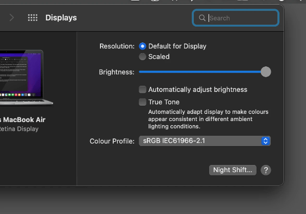
But wait there’s more: Here’s the kicker – look at your computer or device display settings and check to see if your display is optimised and close to the required values and colour profile.
Before ‘shouty man at model bench’ starts growling into its screen, those swatches are the real deal by the way, nothing wrong with them, just as there’s nothing wrong with our model paint values (actually there is with that ‘scale distance fade effect’ stuff – that’s scientifically provable as wank).
Time for a lie down after all that.
Until next time, Kia kaha . . .
http://hyperphysics.phy-astr.gsu.edu/hbase/vision/rodcone.html
