
A journey into decoding orthochromic imagery for model makers.
‘The one where a black and white image tells lies’
After six gruelling hours in the kitchen with Julia Child and a needlessly complex Boeuf Bourgignon recipe, I retreated to the chaise to recover from the worst effects of the shallot fumes and contemplate the instruction sheet of recently purchased Kōtare Spitfire Mk Ia.
It pays to read these things . . .three times apparently.
On discovering that the instruction booklet, which sure is fine lookin’, but harder to follow than one of Ms. Child’s convoluted recipes – makes mention of an obscure thing called orthochromatic film, I got me to thinkin’.
A ha! Says I, I know what that is! And I’ve got just the model to illustrate the technical principle too.
March 2025 addendum: Those WNW/Kotare copy instruction booklets are, after 50 years of vainly sticking plastic bits together, quite possibly the hardest things to follow I’ve ever seen in the hobby. If you happen to have (like 10% of all males) a colour vision defect, or are dyslexic or have other impairments. Anyway thought I’d get that observation/ snarky jibe in. (I write and design learning content for a living don’t bang on the cage). Jogging on in three, two. . .
The following is an abridged excerpt from my forthcoming photography for scale modellers manual.
Aussi, allez Emmanuel Macron ! Donnez un coup de pied à la twat tangerine là où ça fait mal.
That grey surely cannot be red, it’s too blue
I’ve resisted the urge to mention black and white when talking about scale model photography until now, largely because digital imaging creates visible colour by using Red, Green and Blue pixels.
We need to have a good grasp of how this colour mix and calibration of light temperature works digitally because all of our colour fidelity and accurate model colour stuff depends on it.
Behind all this hip and groovy modern digital colour blocks stuff is good old-fashioned black and white.
More accurately referred to as a monochromatic greyscale, (any single colour can be described as mono-chrome) digital black and white, like the RGB colours we looked in a previous post, has 256 distinct steps between absolute black (0) and brilliant white (255).
This doesn’t sound very impressive at all until we realise that our eyes can only distinguish around 30-35 distinct levels of grey between white to black even under ideal lighting conditions.
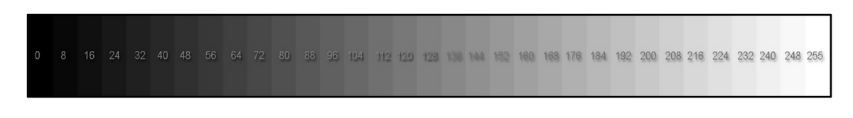
This inability to distinguish between more levels or gradients also holds true for a single colour too. In reality we can distinguish even less variations of some colours because our vision is less sensitive to certain colour wavelengths.
It stands to reason that colours at each end of the visible spectrum are harder to distinguish for the human eye as they get closer to limits of the visible part of the electromagnetic spectrum.
Greens on the other hand are the easiest to differentiate tonal variations of – that is if we’re not suffering from a colour vision impairment.
Oh fab! We can work out all those various shades of Farbton 81 A,B,C. . . then (joke)
So why is knowing this important?
Monochrome film images are susceptible to a range of variables such as changes in film development temperature and time, variances in processing chemistry quality, and variations in darkroom printing practices.
Add the variable ‘skill’ of the photographer or darkroom technician when they are printing the image and a variety of photo papers which all display contrast and tone differently to the mix, and digital colour starts to look a whole lot easier.
Decoding the black and white image
Our hobby relies on black and white imagery for its reference material and it is here that all sorts of difficulties can lurk.
The main source of confusion comes from the rather weird and questionable practice of trying to accurately define colour from the tonal values of a black and white image.
Despite what many so-called experts claim, the ability to deduce a single colour from a black and white image is at best, educated guesswork and at worst just personal opinion.
Simply put, it is next to impossible to do this accurately and consistently due to the basic reasons given above. All of which are unpacked in much tedious yet essential detail in my previous posts on understanding and applying digital colour.
Think you know your Hellgrun 82 from your Rot 23? Here’s something to think about:
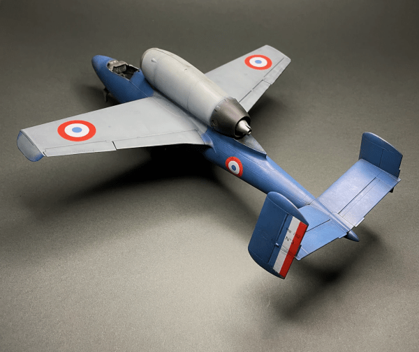
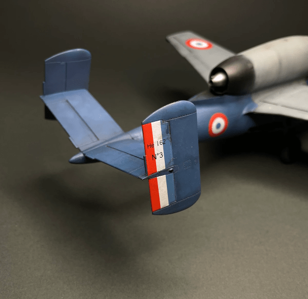
The before and after comparison images of the Heinkel He162 Salamander show how trying to work out a colour from a monotone image can become problematic when different colours are reproduced as similar grey scale values.
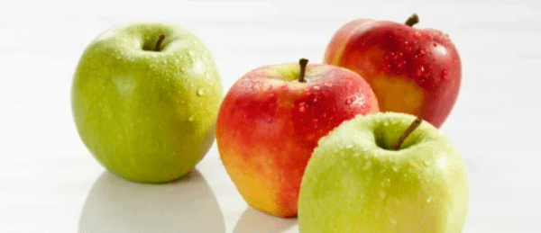
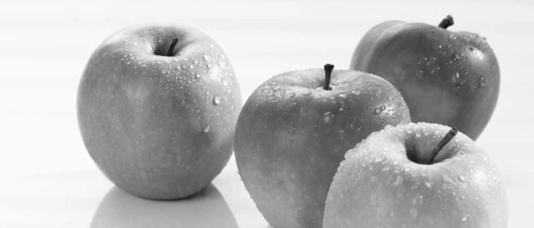
Desaturating a colour image in any editing software to remove the digital RGB colour information makes the red and green tones almost indistinguishable. There is no digital trickery below.
Not convinced, but don’t have a red and green model handy? Try it for yourself by photographing a red and a green apple side by side with your camera set to its basic black and white mode.
But what if that black and white image isn’t what it seems eh?
Have you seen black and white photos of aircraft where the tonal values of the camouflage and markings seem to be at odds with other common images of a similar subject? Even reversed in some places?
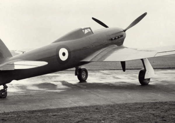
This well known Typhoon prototype image is actually not a glossy one colour but is a standard two-colour RAF scheme with white and black undersurfaces (according to Hawker documentation).
For starters, the gloss is due to rain (the tyres are a give away and shiny plus the water on the ground…). The almost black red inner portion of the roundel plus exposure values defines this as an ortho film image.
It’s largely accepted that this aircraft is standard fighter camouflage dark green and dark earth with white and black half and half undersides. The dark green and dark earth have very similar greyscale tonal values in ortho, the dark earth having a red/brown component is reproduced as a very dark tone, and we can just about make out a demarkation line in front of the roundel. Some modeller ‘expert’ sources state it as being painted NIVO with silver undersides (Night Invisible Varnish Orfordness – a night bomber green value used in inter-war crap aeroplanes such as HP Hereford upside-down biplane bombers) but this seems unlikely as NIVO was phased out in the mid 1930s and this is a fighter.
Regardless, it just goes to show we really cannot begin to guess what a colour might be from a black and white photo even when we have some sort of mono reference point.
Anyway back to ortho film: It’s widely assumed that being able to process the film and create an enlarged print under the same darkroom red safelight lighting during wartime would significantly speed up the production of aerial imagery having no need to unload the film from the camera back and process it in absolute darkness. It also means that some camo schemes would merge (ala the terrifying tiffie) certain colours would be more visible on the photo-recon images and easier to spot. Orthochromatic film was widely used from around the 1920s but fell out of use in the late 40s.
So while panchromatic (sensitive to all visible light and colour frequencies) film creates grey scale values which largely represent the value of the colour, ortho film’s increased green/blue sensitivity causes blue and some wavelengths of green objects to appear lighter, and more importantly reds/oranges darker, even black depending on the exposure and light values.
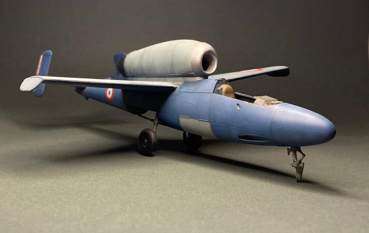
Enter the dragon, err Salamander – a truly fucking barking mad idea if ever there was one. (See what happens when Nazis lose their shit and get desperate)
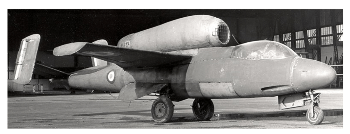
The monochrome tones on the Salamander look very similar to the previous green Luftwaffe model version above, but we know the outer roundel is a red value in French air force markings, so we need some altered points of reference.
remember we are not vainly trying to deduce an exact colour value here, just that it’s ball park red or blue or green.
We also know from written documentation and personal accounts of the day that these aircraft were likely painted in three possible post-war schemes of overall red, overall blue or two greys.
Given that ortho film displays red as a dark tone and shows blues as a lighter tone, we can deduce that this is probably the blue aircraft. Why so bold ? Well, because the fuselage grey value appears similar to the ortho blue roundel’s light grey value.
Come with us now on a journey through time and space through Ernst Heinkel’s head
So given that we now know the image is an ortho greyscale and those values are not true representations, the ‘real’ airframe colour value is anyones guess.
We know it’s probably not one of the documented red painted aircraft because the outer roundel is red and the ortho film shows this as very dark. The fuselage would be a similar dark value. So it could be blue or maybe grey based on the limited known documentation. Also, the artistically inclined French had painted over the original Luftwaffe colours which will act in some way to influence the final colour value.
We might make a ball-park (I must stop using Americanisms) estimation that the MG151 access hatch could be the original German Farbton 76 (a variable pale blue) or is a replacement taken from the other post-war test airframes. But this is where it gets interesting – the intake, engine cowling and fuselage to wing fairing are all different values to the fuselage. Perhaps a similar colour to the access hatch, or did these components belong to the other French He162s, or even from a cannibalised Luftwaffe ‘bitsa’ airframe?
Depending on the exposure, ortho makes greens look lighter too, so the engine cover might even be Farbton 82 bright green? And what about the intake, is that unpainted metal? The wingroot fairing seems to be the same tone as the anhedral wingtip too, although the angle of this is reflecting light in a different plane to the root, so we might guess or wishful think that the upper wing is a similar colour value.
Fascinating aviation ‘archaeology’ and food for thought, or just personal conjecture?
Gallery
The images of my partially finished Revell 1/32 He162 Spatz (another one of those kits which got boxed up when I fell out with myself and the hobby) were all taken on an Apple smartphone 12 with a single point circular budget LED light source designed for selfie and blogger images.
It has an output of around 5600K and has a basic cool/warm setting, these images are taken with the ‘cool’ setting as this has the best colour rendering index (CRI) meaning that the LED light output will cover as much of the visible colour spectrum as possible. Its a cheap and cheerful K-Mart unit and this blog is all about doing good stuff with the minimum of fuss and minimum of cost.
The lights’ kelvin K setting was matched in the camera by using the Reeflex camera App’s white balance (WB) slider. Check out my other posts about how to do this and other neat photography tricks.

2025 update: It’s another ‘almost’ kit that seems to have lost its kit nose wheel and other small bits along with my interest in all things styrene kit. Not that it matters anymore you understand.
That’s it quite possibly the last archived post moved here from the defunct Strikingly site.
thankyou for stopping by to read.
Kia kaha noho kaha. 2025
References
Hawker -Siddeley Aircraft, British Air Ministry, Public domain, via Wikimedia Commons
Gyon, H. (n.d.) Sirpa Air Collection.http://www.traditions-air.fr/
There are a wonderful set of articles by Allesandro Orseniga about Luftwaffe colours. So far the only person who seems to have taken account of the issues of orthochromatic and panchromatic film, the viewing device’s colour screen variations, printing limitations and colour systems when talking about Luftwaffe colour variation.
An enlightening and very well researched web site.
